Check out my latest work at
Imperfect Beauty
Check out my facebook page for my most recent work: facebook.com/Nicoleweeksphotos
Sunday, November 24, 2013
Sunday, May 19, 2013
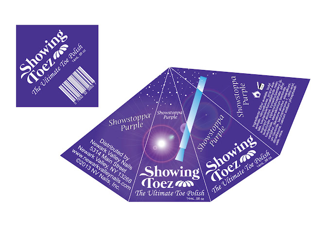
Showing Toez package essay
The
shape of my nail polish package is different and unique just like you should
feel while wearing this toe nail polish. It communicates the concept by
incorporating a lens flare, which resembles a spotlight, which also connects
the nail of this particular color “showstoppa purple.” This design conforms to
the rule of thirds by placing the main information at the bottom, which I
wanted the most emphasis put on the bottom where the logo is. There is negative
space throughout my design but it adds to it so it doesn’t become cluttered.
Emphasis was put on the logo because it was one of the biggest elements in the
design and on the front the brush is pointing to it. Contrast was used with the
dark purple background and the white text being dark against light. I aligned
the text so it was centered throughout the whole package and the ingredients conformed
to the shape of the package. Flow was incorporated because when you see the
brush on the front it wraps almost around the whole box. The name of this
particular toe nail polish was repeated on almost every side of the package as
well as the logo. The purple color of the box is the actual color of the nail
polish, so that the consumer is able to pick it up and hold it against their
feet to see if it will look good or not rather than having a little piece of
the package be the actual color. The logo “Showing Toez” is fun and elegant
which will hopeful grab the attention of consumers and give them a feeling that
if they wear this toe nail polish they will be able to be a “showstoppa.”
Wednesday, May 15, 2013
Tuesday, May 14, 2013
Monday, April 29, 2013
Monday, April 22, 2013
Tuesday, April 16, 2013
Subscribe to:
Posts (Atom)


